
Building a prototyping tool for people with no design skills
Before AI could generate mockups on demand, there was a gap: product managers, developers, and founders had ideas they couldn't visualize without hiring a designer or spending weeks learning Figma. Stage was built to close that gap.
I owned the full design process — user research, product decisions, and every screen. The main challenge was figuring out which design concepts actually matter to someone who's never used a design tool, and how to make those feel obvious.
The Core Idea
Existing prototyping tools are built for designers. Everything about them assumes design knowledge: components, variants, auto-layout, color systems. For a product manager or developer with an idea to ship, the learning curve alone is a blocker.
Our goal wasn't to make these tools easier to learn. It was to question which concepts non-designers actually need to visualize their ideas. Take the basic building blocks of any design tool — rectangles, shapes, a pen tool. We removed them entirely and replaced everything with a set of configurable components. Enough to build any interface, without needing to know how to design.
The Early Version
The first version was radically simple by design. Just a wireframe constructor — no links, no styles. We had one hypothesis to test: if we took the same component logic used in our UI systems for designers, but wrapped it in a much simpler interface, could we open up prototyping to people who'd never touched a design tool?
Even the visual style was deliberately playful — more like a constructor kit than a design app. Drop in a component, see the result.
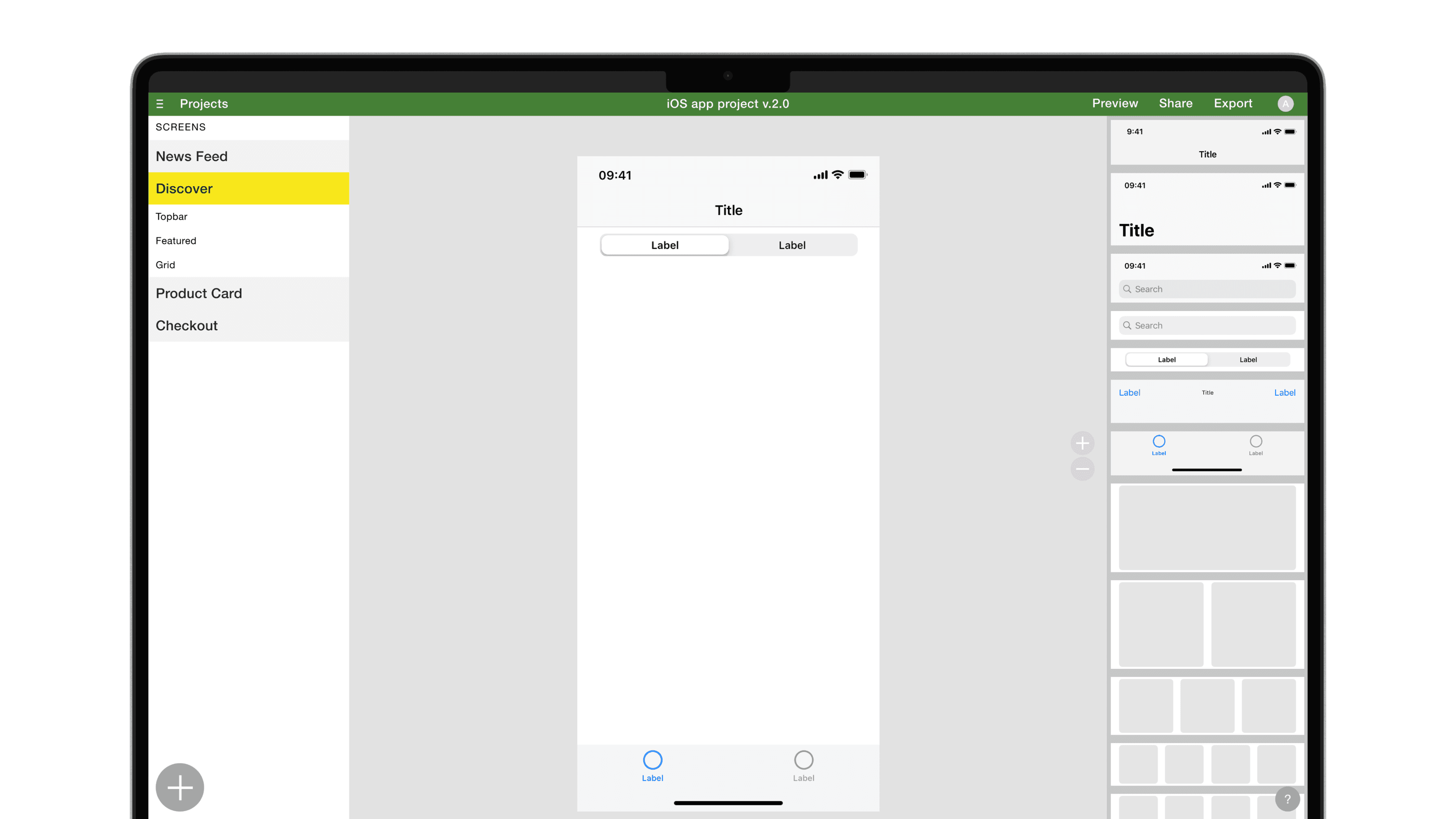
First Results
After the pilot, I ran a series of user interviews. The signal was clear: the problem was real, and people genuinely liked the concept. But after the initial session, they didn't come back. Stage was too limited to build anything they'd actually use — so there was no reason to return.
Users needed the basics — links between screens, more component variety, and a way to export to Figma so they could hand the work off to a designer or developer. The concept worked. The tool just wasn't there yet.
Expanding the Functionality
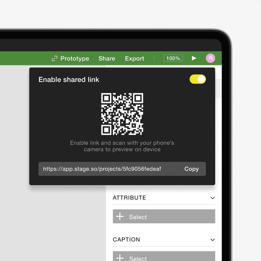
So we went all in on what users actually asked. More components, more variety — each configurable through plain settings: what's on the left, center, right, which icon, which text. Links between screens to make prototypes actually clickable. Sharing via link, so anyone could open and interact with the result. And export to Figma, for when users were ready to hand things off or take them further.
Stage finally had enough to build something real.
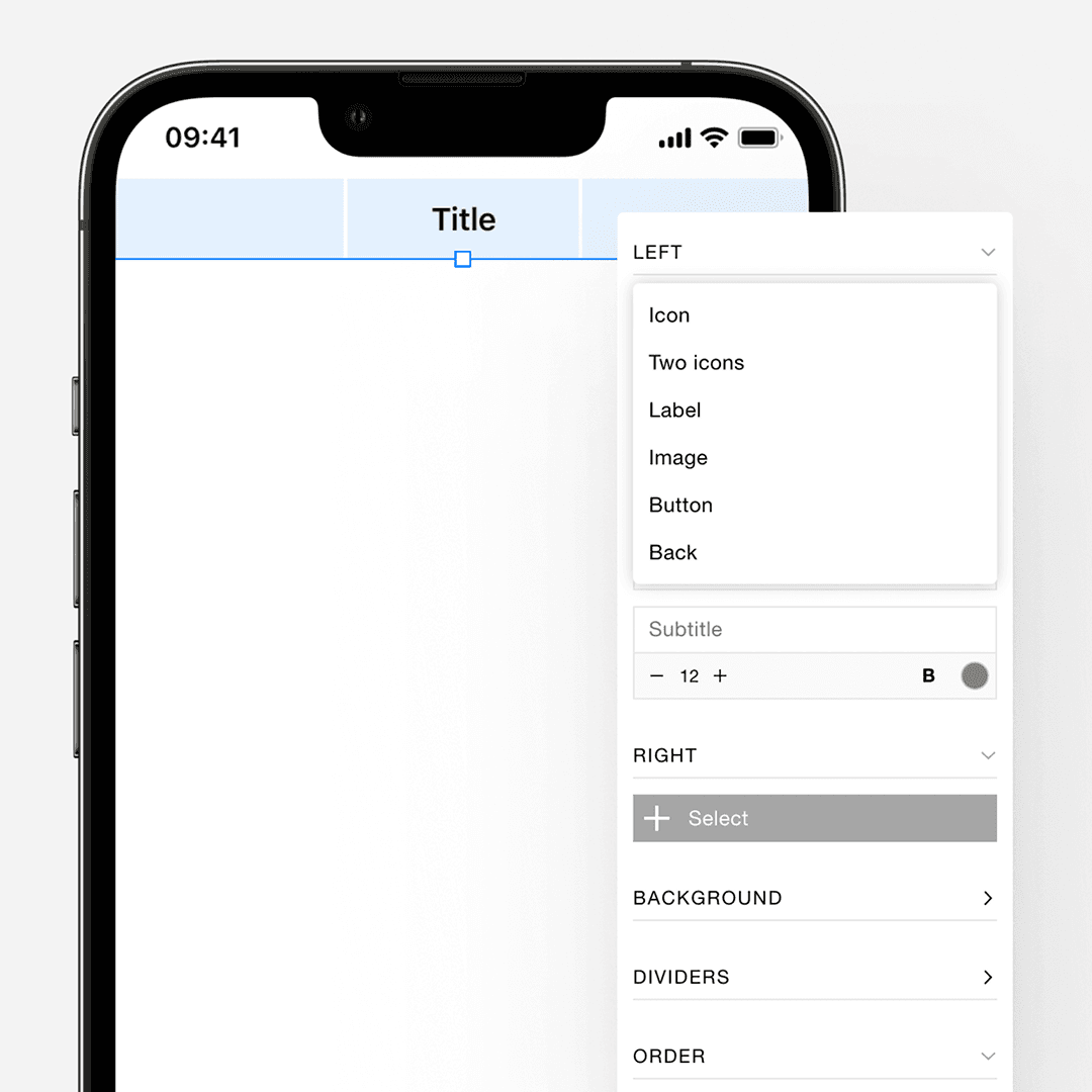
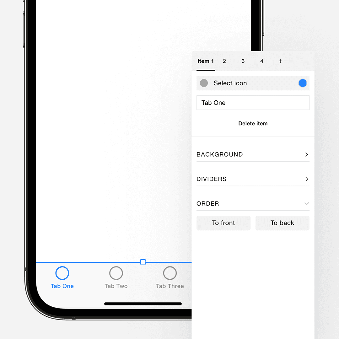
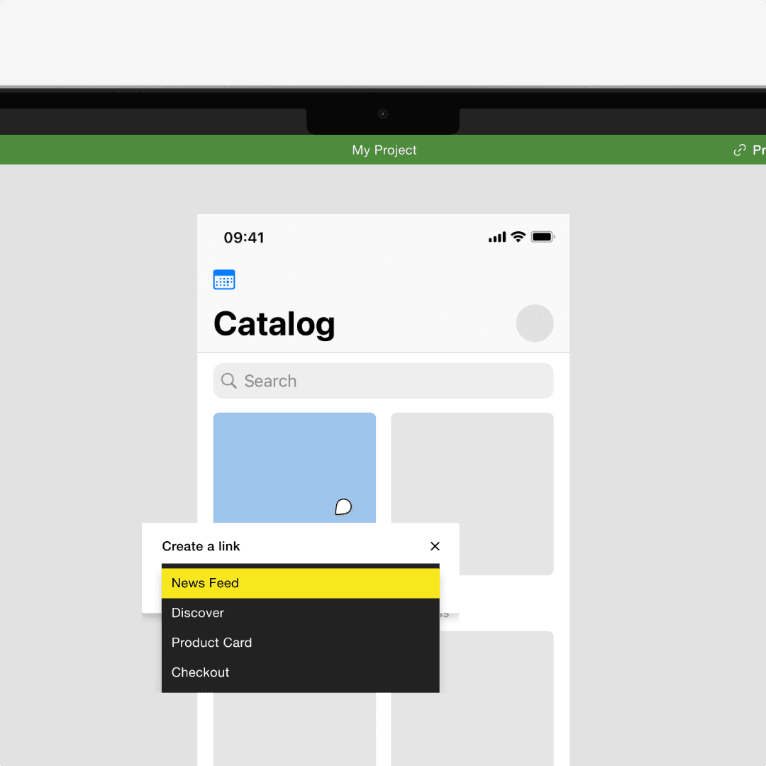
Components and Patterns Libraries
Talking to users, I noticed that even non-designers work with design tools on a basic level — Figma to see what designers created and leave comments, Canva for basic graphics. But Figma's design systems were still built for designers, and Canva didn't have enough for UI design and prototyping. We saw an opportunity there.
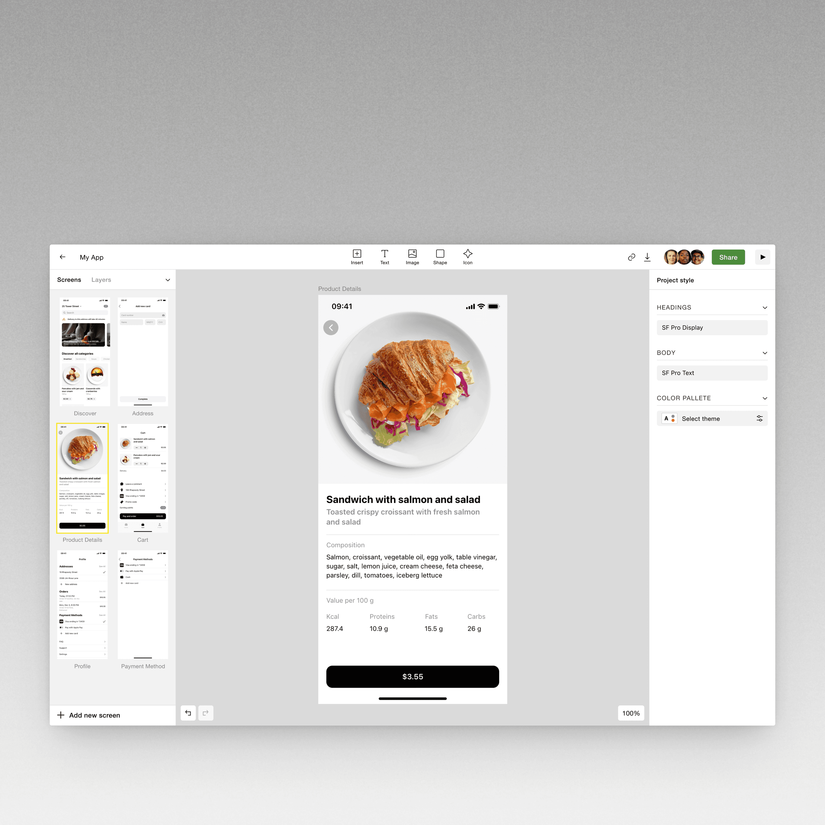
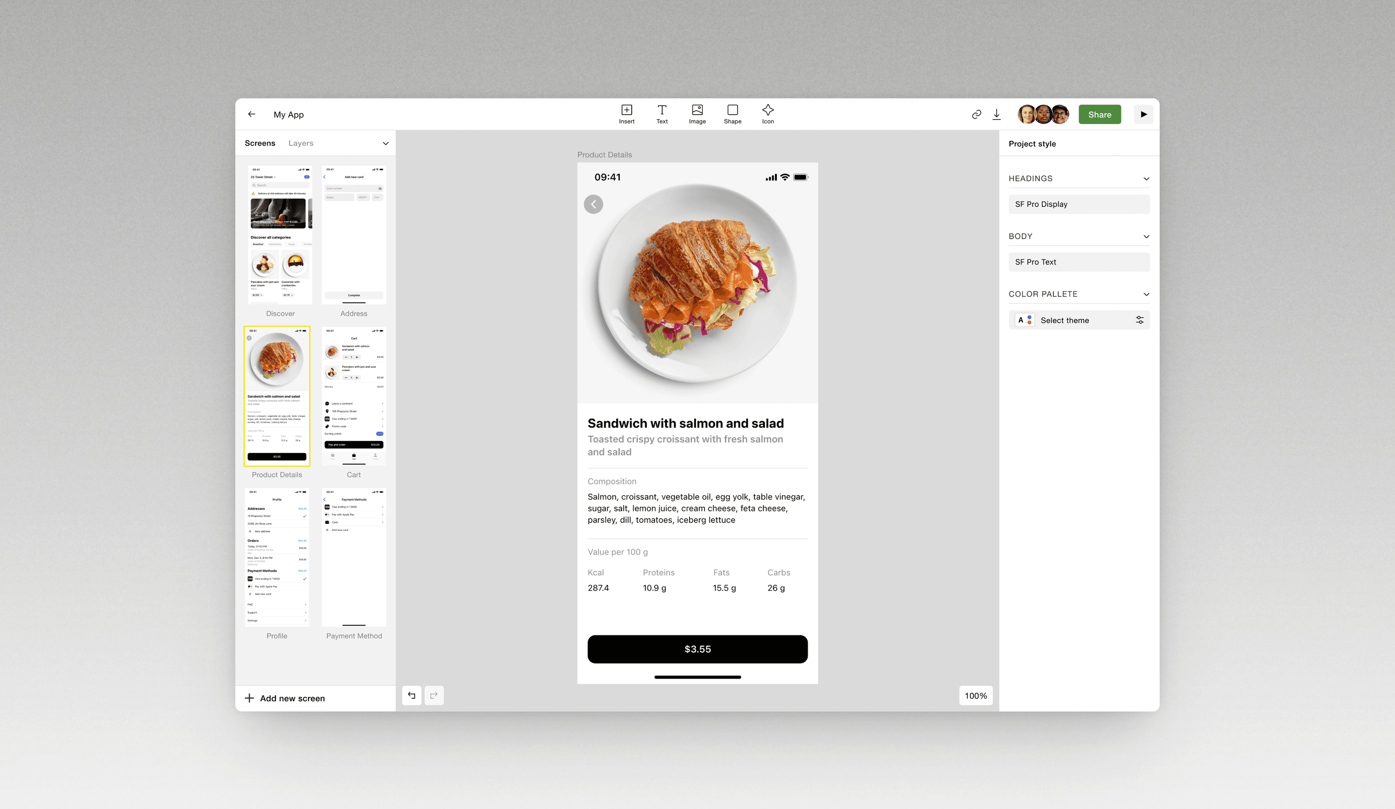
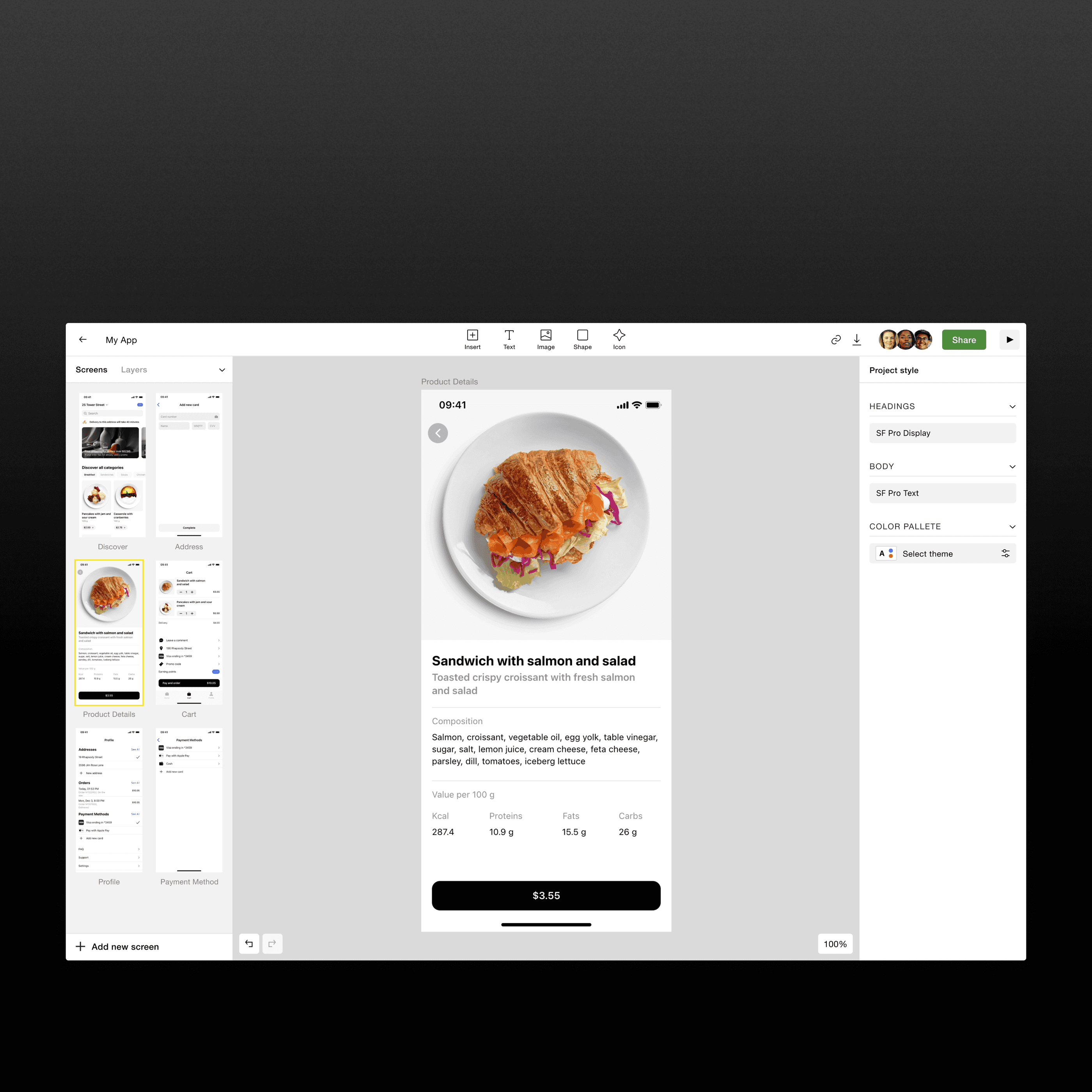
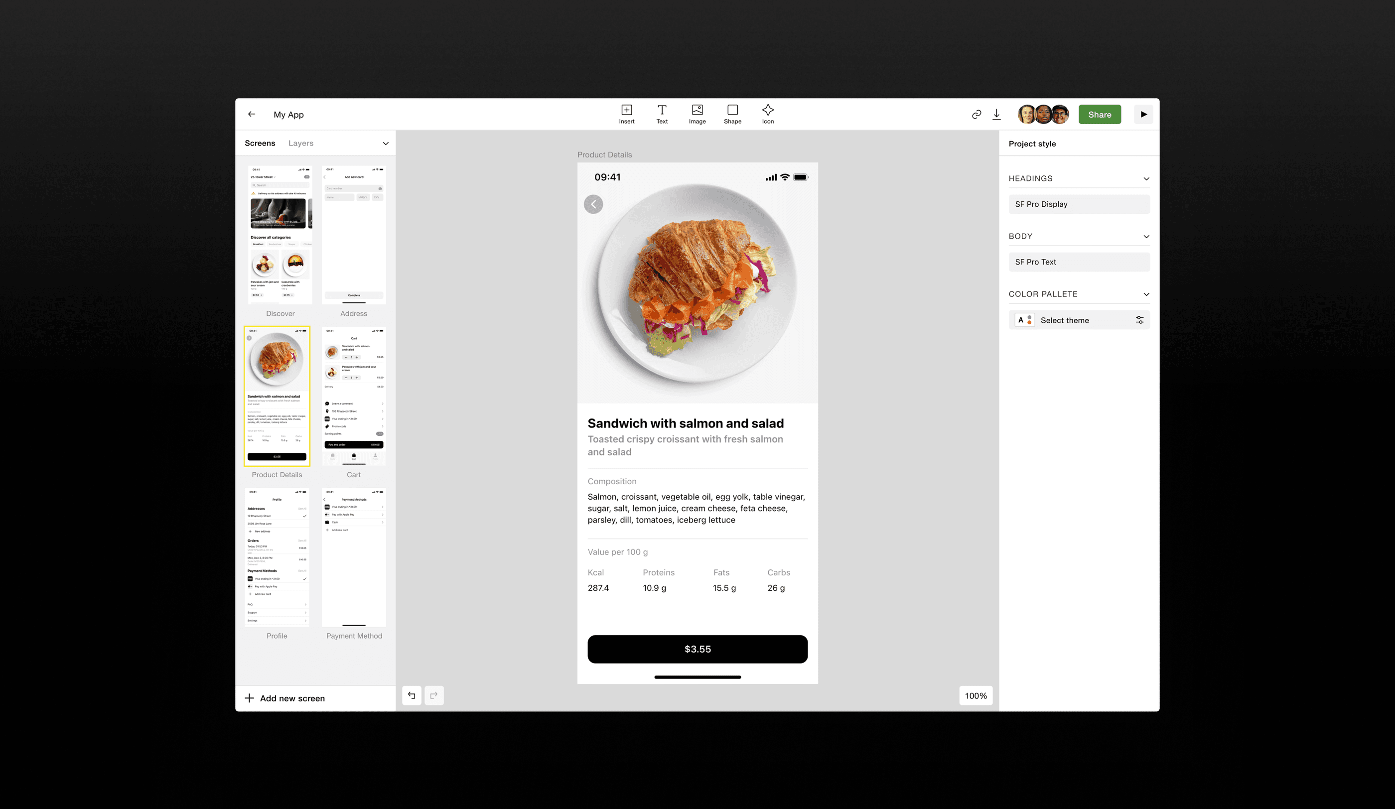
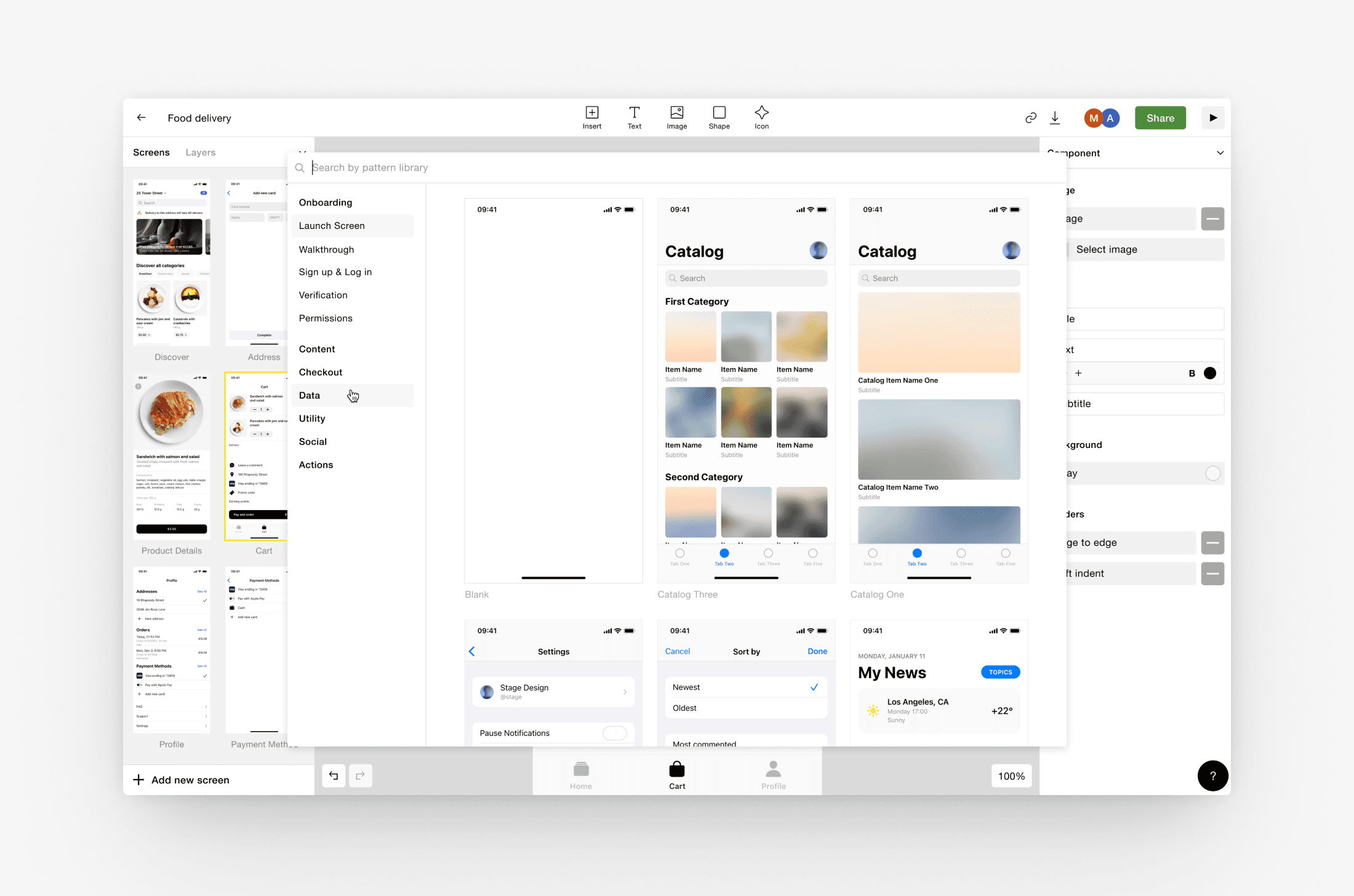
The key decision was to shift the focus from components to full screens. Instead of starting from scratch, users could pick a ready screen and customize it with components. Screen patterns moved from a separate function to appearing every time a new screen was created — organized by category, like a design catalog similar to Mobbin, but fully customizable.
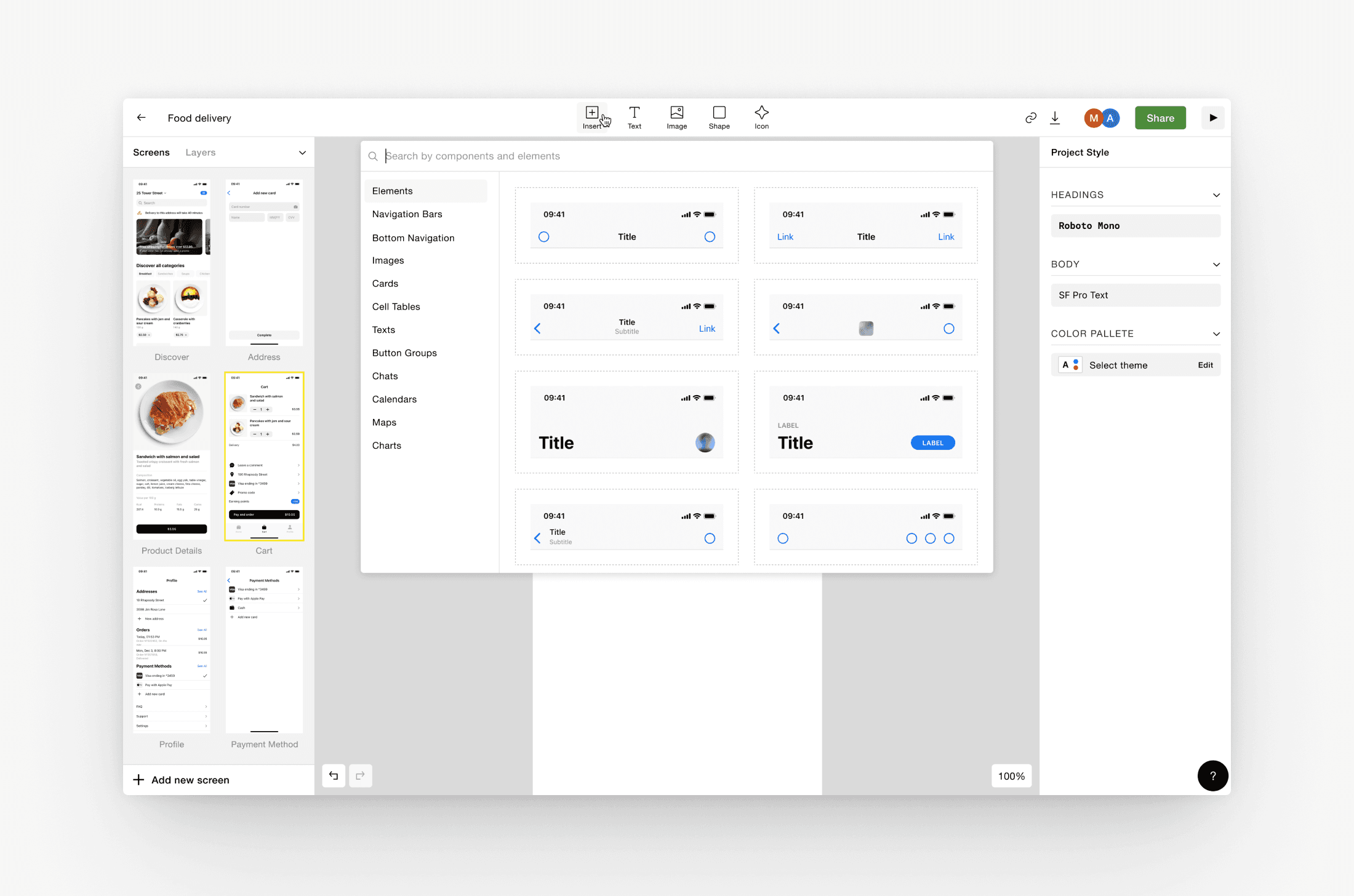
We also added image uploads, so users could go beyond wireframes and get closer to real design. Screen previews replaced the layers panel. Instead of shapes and drawing tools, users had a library of ready components, text styles, and icons.
54%
of users added a component
32%
of users added a screen pattern
“Canva for User Interface Design”
We reframed our pitch to funds and angel investors around a new direction: Canva for user interface design. Not just wireframes, but real app design for non-designers. The response was concrete enough to commit to the pivot.
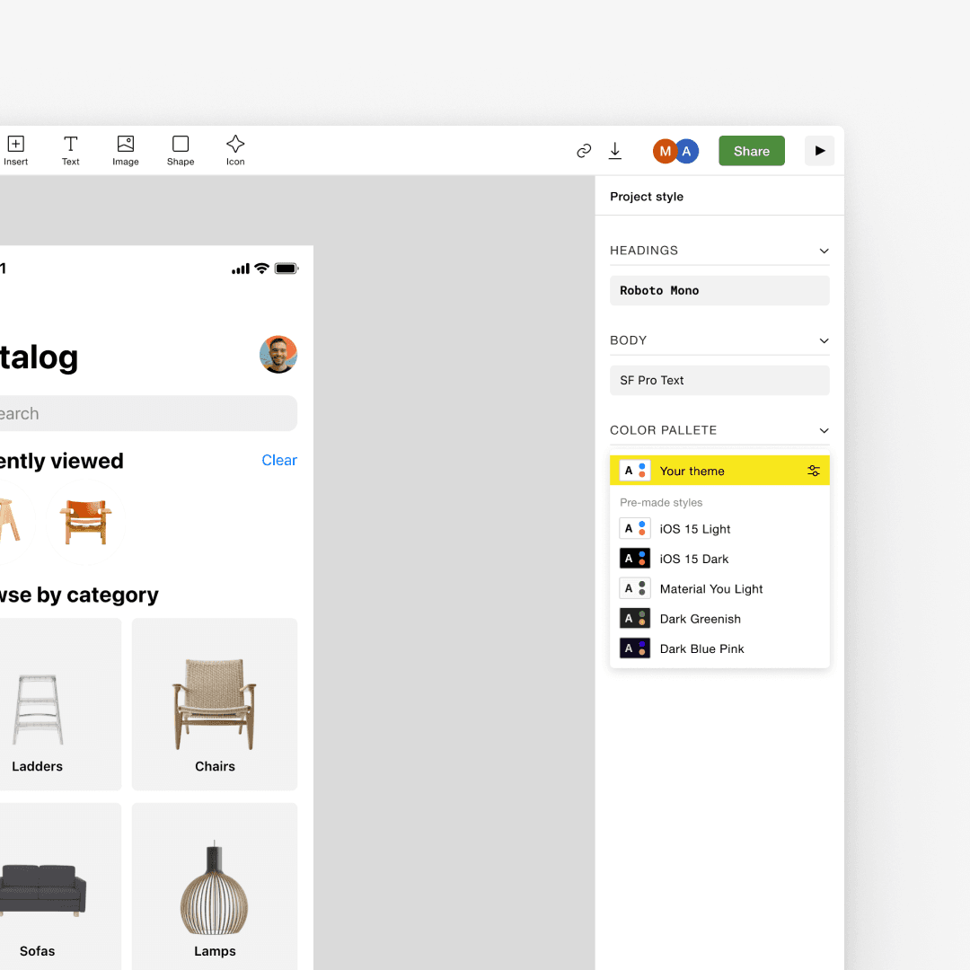
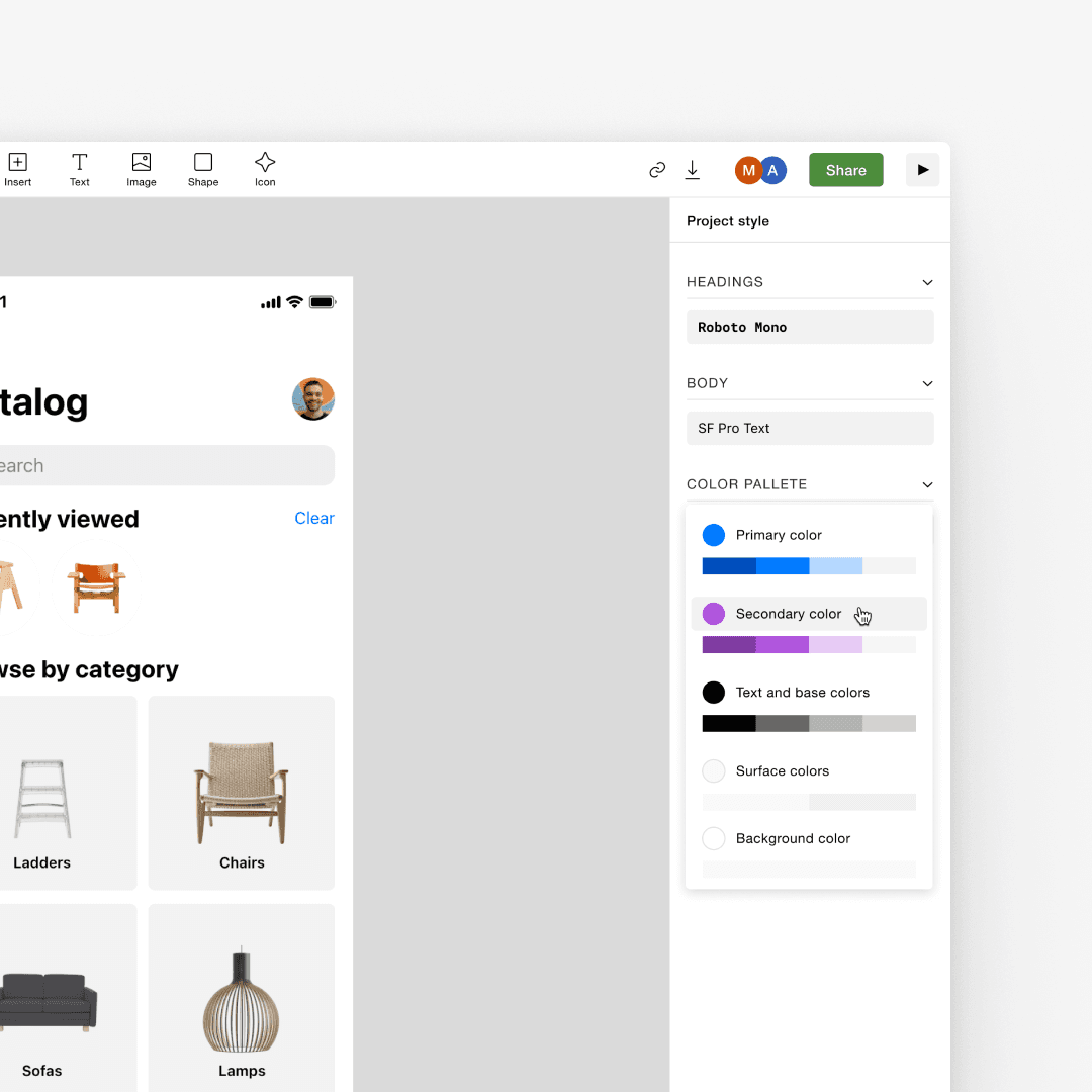
The challenge was adding real customization without making Stage feel complex. The approach was to constrain it deliberately: two text styles, five base colors. Non-designers could build their own visual style without any design knowledge. Pick a font from Google Fonts, adjust one shade per color, and the entire design updates instantly. Not award-winning results, but more than enough to test an idea.
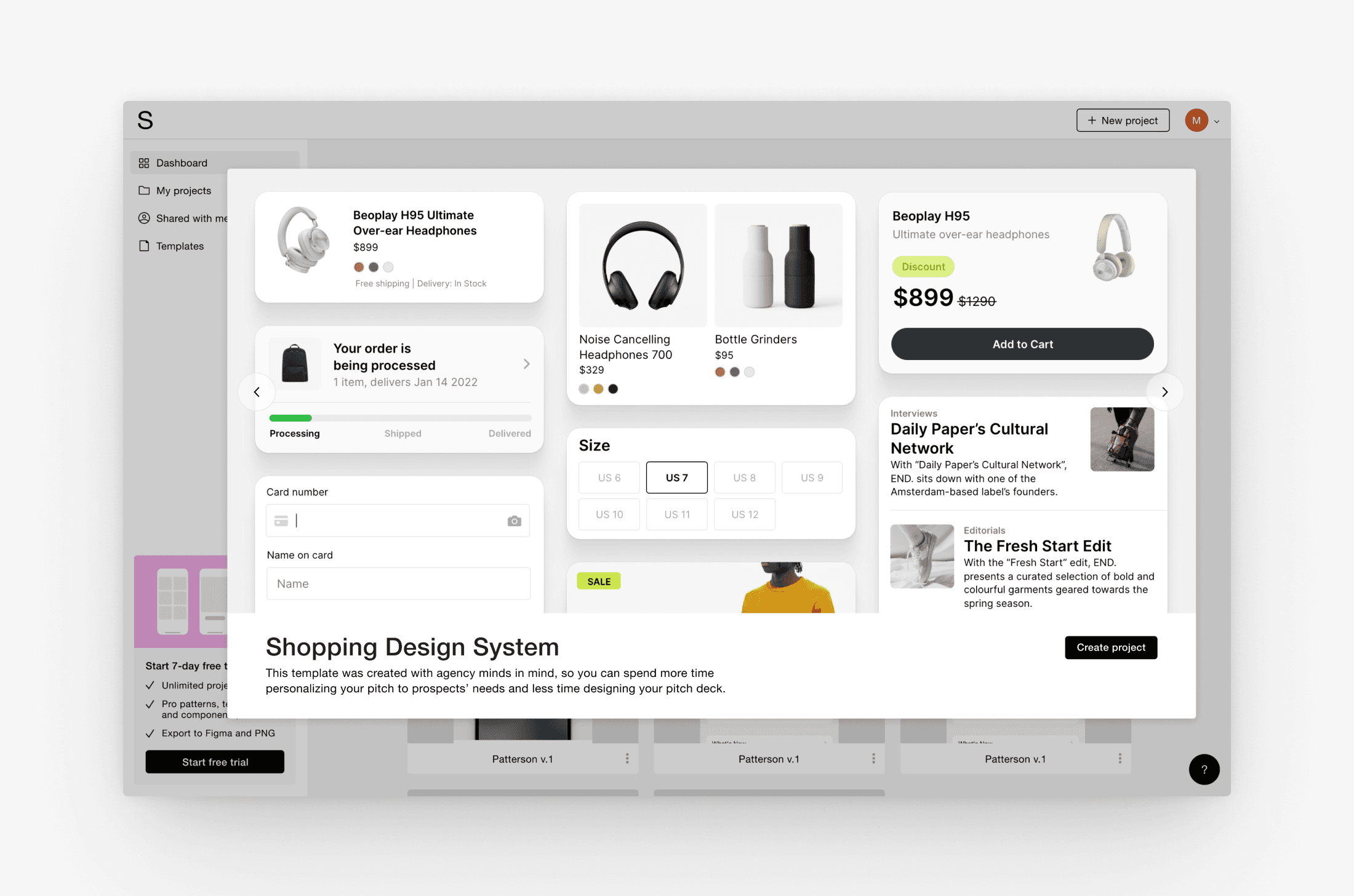
I also created themed design system presets: Shopping, Food Delivery, and others. Sets of screens and components with pre-applied styling to give users an even faster starting point.
Collaboration and Multiplayer
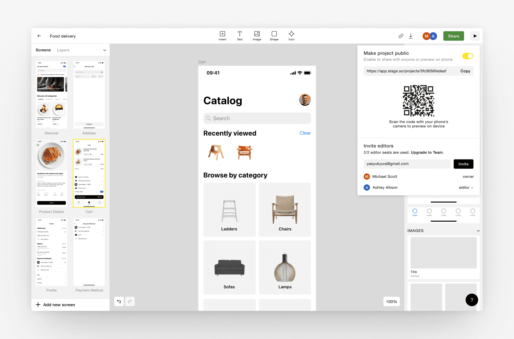
To grow organically, we needed users to bring their colleagues. So we added collaboration — invite teammates to a project, work on it together. Eventually even multiplayer: you could see which blocks someone else was editing in real time.
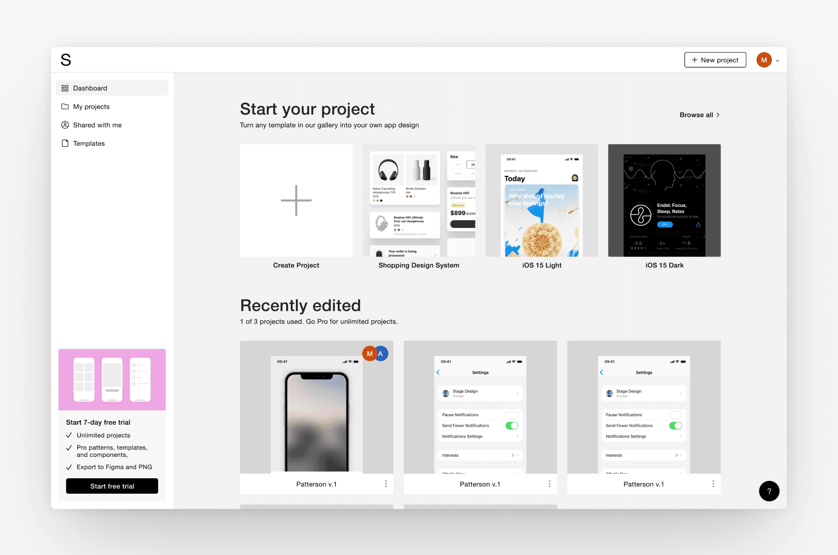
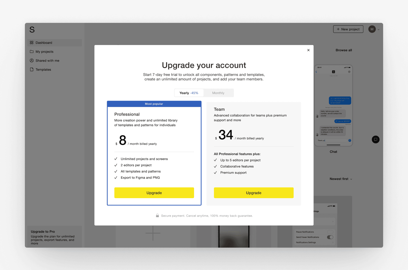
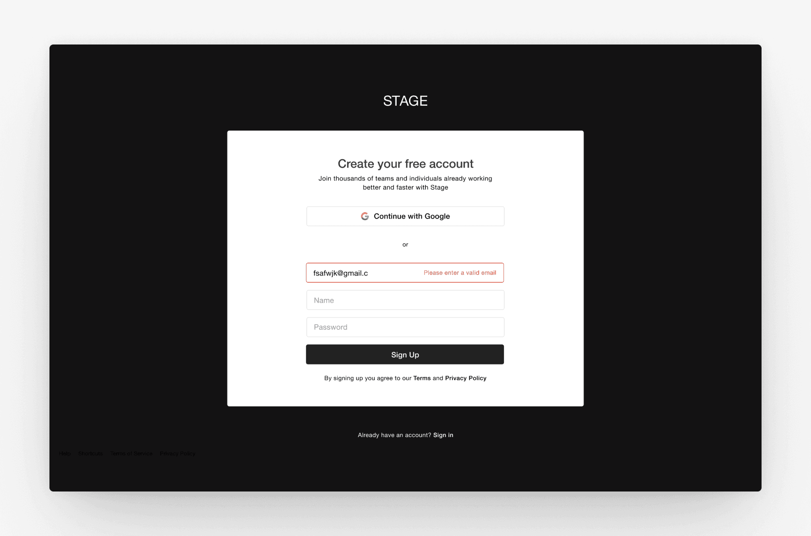
We also built out the account side of the product: user dashboard, paid plans, login and signup.
Results and Lessons Learned
After a year of constant iteration as a two-person team, we nearly closed a seed round and reached the final interview with Y Combinator.
4,500
users registered
1,100
monthly active users
35%
First week retention
Looking back, I think we expanded the functionality too early. Instead of continuing to look for the core value — the thing only Stage could do — we kept adding features. At some point we ended up in direct competition with giants like Figma and Canva, which was never a fight we could win.
Unfortunately, we couldn't find product-market fit and had to close the app. A year of full ownership over every decision — research, redesigns, pivots, launches, a YC interview — is hard to replicate. I learned what two people with one goal can build just in one year. And how much more precise my product decisions need to be.